In an era where trillions of data points flow through trading floors, corporate boardrooms, and economic reports every minute, mastering the art of visualization is no longer optional. By rendering vast datasets into intuitive visuals, finance professionals unlock real-time insights for smarter decisions and transform overwhelming complexity into actionable clarity.
Whether you are a CFO presenting to a skeptical board or an analyst racing to identify hidden risks, compelling visuals empower you to communicate with unprecedented speed and precision.
Financial markets are shaped by human behavior, shifting macroeconomic forces, and lightning-fast technology. Raw numbers alone cannot capture these dynamics. When you harness visualization, you craft narratives that resonate emotionally and intellectually.
Research shows businesses prioritizing visual analytics are 28% more likely to find timely insights, turning raw information into competitive advantage.
Choosing the right technique depends on data type, volume, and the story you aim to tell. Below is a concise reference for high-impact charts.
Beyond charts, tools like pivot tables and infographics elevate exploration and storytelling, making complex quantitative models accessible to every stakeholder.
No single platform reigns supreme; each offers unique features tailored to different scales and objectives. Your selection should balance ease of use, integration depth, and advanced analytics capabilities.
Power BI’s AI Copilot transforms natural language queries into visuals, while Tableau’s VizQL engine delivers interactive storytelling at scale. Qlik Sense’s associative engine uncovers hidden relationships, and Looker Studio offers a free, cloud-native entry point for small teams. Excel remains a familiar powerhouse for rapid prototyping and Monte Carlo simulations.
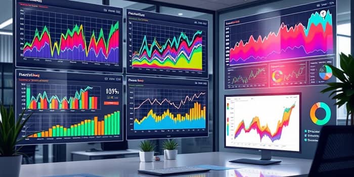
Dashboards are your command center, consolidating revenue, expenses, cash flow, and risk metrics into a unified interface. When designed thoughtfully, they foster proactive decision-making and operational transparency.
Consider these strategies:
With over 10,000 banks trusting platforms that process 5 billion records across 30+ years of history, the potential to forecast and optimize has never been greater.
Adhering to these principles ensures your visuals not only inform but also inspire confidence among executives, investors, and cross-functional teams.
Imagine a treasury team detecting early signs of liquidity stress through a heat map that flags unusual cash outflows. Or a portfolio manager fine-tuning asset allocation by correlating returns with market volatility in a dynamic scatter plot. In economic forecasting, analysts now visualize foot traffic data, bankruptcy filings, and consumer spending to predict GDP trends before official releases.
One multinational retailer validated quarterly earnings against store-level spend data, uncovering a hidden sales channel that boosted revenues by 5%. Another hedge fund leverages continuous dashboards to automate risk monitoring, reducing manual reporting hours by 40% and reallocating talent to strategy development.
These success stories underscore a simple truth: when finance leaders embrace visualization, they catalyze innovation, agility, and sustained growth.
As you embark on your own journey, remember that the best visuals marry robust analytics with clear design. Start small, iterate quickly, and let your audience’s feedback guide your evolution. The potential to revolutionize your organization’s financial insights is within reach—one chart at a time.
References